
By The Richards Group
Color is the first thing a room says to you. Before you notice the furniture, before you take in the light, before you've even crossed the threshold — you feel the room. That feeling is almost always color doing its quiet work.
In The Beaches, homes have a particular relationship with light. The lake softens it. Morning comes in silver and gold depending on the season. Afternoons stretch long and warm in summer; in winter, rooms hold a blue-grey stillness that has its own kind of beauty. The right paint color doesn't fight that light — it listens to it.
We think about color constantly. Here's what the science — and the experience — actually tells us.
Understand How Light Changes Everything
Before you choose a single swatch, understand this: no color looks the same in every room. The same white that feels crisp and clean in a south-facing kitchen can read cold and flat in a north-facing bedroom. Paint is not static. It is in constant conversation with your light.
Natural light is the starting point. Note which direction your room faces:
- South-facing rooms receive warm, consistent light throughout the day — they can handle cooler tones without feeling cold
- North-facing rooms receive indirect, cooler light — lean toward warm whites, soft creams, and earthy mid-tones to compensate
- East-facing rooms glow in the morning and cool by afternoon — great for energizing colors in spaces where you start your day
- West-facing rooms come alive in the evening — warm tones deepen beautifully under that late-day light
Artificial light matters too. Incandescent and warm LED bulbs push yellow; daylight bulbs read truer to natural conditions. Always view swatches under the actual lighting conditions of the room — not just by the window.
The Psychology of Color, Room by Room
Color science is real. Hue, saturation, and value all affect mood, perceived temperature, and even how spacious a room feels. Here's how we think about it, space by space.
Living Room: Warmth and Presence
The living room is where the home exhales. It should feel welcoming — a space people want to stay in. Warm neutrals, soft taupes, and earthy terracottas do this well. Deep, saturated tones — forest green, navy, a warm charcoal — create intimacy and drama when the room can hold them.
Avoid anything too cool or too bright. Living rooms reward subtlety.
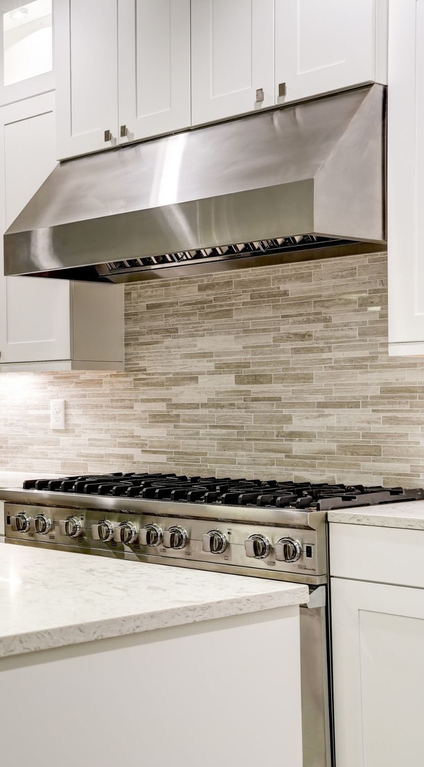
Kitchen: Clarity and Energy
Kitchens want to feel clean, alive, and functional. Crisp whites and soft off-whites remain enduringly right here — especially in older Beaches homes where original cabinetry and tile benefit from a light, uncomplicated backdrop. Soft sage greens and warm creams are having a well-deserved moment. Deep tones work beautifully on a single island or lower cabinetry as contrast, but proceed thoughtfully on all four walls in a smaller space.
Primary Bedroom: Quiet and Rest
The bedroom is a sanctuary. Color psychology is unambiguous here: cooler, lower-saturation tones support rest. Dusty blues, soft lavenders, warm greiges, and muted greens all perform well. High-saturation colors — anything that vibrates visually — work against the nervous system when the goal is sleep.
Keep the palette gentle. The bedroom should feel like a exhale at the end of the day.
Bathroom: Spa or Statement
Bathrooms give you permission. The scale is small enough that bold choices feel curated rather than overwhelming. A deep, moody navy on all four walls with white trim can feel like a boutique hotel. Soft stone tones and warm whites extend the feeling of cleanliness and calm. Glossy finishes amplify light in smaller spaces — worth considering where square footage is limited.
Home Office: Focus Without Fatigue
The office asks something specific of color: stimulation without agitation. Soft greens — sage, eucalyptus, muted olive — are consistently cited in color psychology research as supporting concentration and reducing eye strain. Warm mid-tones work well. Very bright whites can actually increase visual fatigue over a full workday; consider a warm white or pale tint instead of a pure, high-contrast option.
Children's Rooms: Joy Without Chaos
Resist the urge to go primary and saturated just because it's a child's room. Soft, playful tones — a warm coral, a dusty sky blue, a muted sunshine yellow — bring joy without visual chaos. Children's rooms evolve; a color that photographs beautifully now should be one you can also repaint without regret in three years.
The Undertone Is the Thing
Every paint color has an undertone — a secondary hue lurking beneath the surface that only reveals itself on the wall. That white you loved on the chip? On the wall, it's pulling pink. Or green. Or lavender.
Common undertone families to know:
- Warm undertones: yellow, orange, red — these read cozy and inviting
- Cool undertones: blue, green, purple — these read crisp and calm
- Neutral undertones: balanced between warm and cool — the hardest to find, and often the most versatile
The undertone reveals itself most clearly when placed next to white trim. Test your shortlisted colors next to the actual trim in your home before committing.
Test Before You Commit
Large paint samples — not chips — are non-negotiable. Paint a minimum 12" x 12" swatch directly on the wall. Observe it at different times of day: morning, midday, evening, artificial light only. Live with it for 48 hours.
For those choosing paint colors for your home in The Beaches, this step is especially important. The lake light here is distinctive — it shifts in ways that can make a color behave unexpectedly compared to how it reads in a showroom or on a screen.
Finish Matters as Much as Color
The sheen you choose affects how a color reads and how the room lives:
- Flat/Matte: absorbs light, hides imperfections, feels soft — ideal for bedrooms and living rooms in older homes with walls that have texture
- Eggshell: a slight sheen, easy to clean, the most versatile finish for most rooms
- Satin: a noticeable sheen, very washable — well-suited for kitchens, bathrooms, and children's rooms
- Semi-gloss/Gloss: high reflectivity — ideal for trim, doors, and cabinetry; makes surfaces feel intentional and sharp
In homes with beautiful original millwork — common throughout The Beaches — a glossy trim against a matte wall is one of the simplest ways to let the architecture speak.
The Case for a Considered Neutral
Not every room needs a statement. There is tremendous sophistication in a well-chosen neutral — one that recedes and lets the furniture, the light, and the people in the room become the story. The best neutrals are never quite white, never quite grey, never quite beige. They sit in the in-between, shifting warmly in one light and coolly in another.
These are the colors that photograph beautifully, feel timeless at resale, and never make you tired.
A Final Word on Cohesion
A home reads as a whole. As you move through the rooms — especially in open-concept plans or homes with sightlines between spaces — colors should feel like a family, not a collection of strangers. This doesn't mean everything matches. It means everything belongs.
Choose a palette of three to five colors that share an undertone family or a tonal relationship. Let them play off each other. Let one room feel like a deeper breath of the next.
When choosing paint colors for your home in The Beaches, let the neighborhood itself be part of the palette. The grey-green of the lake. The warm wood tones of century-old floors. The cream of original plaster. The colors that have always lived here are usually the ones that feel most right.
Color is never just decoration. It's the mood your home holds every day.
The Richards Group Re/Max Hallmark — East Toronto's #1 Real Estate Brokerage. therichardsgroup.ca.